Social Media Brand Identity & Logo Design
Social Media Brand Identity & Logo Design
Social Media Brand Identity & Logo Design
Social Media Brand Identity & Logo Design
Selfocus
Selfocus
Selfocus
Selfocus
Case study of a social media brand identity and logo design for Selfocus, a motivational TikTok and Instagram platform that supports young audiences with calm, uplifting visual communication.
Case study of a social media brand identity and logo design for Selfocus, a motivational TikTok and Instagram platform that supports young audiences with calm, uplifting visual communication.
Case study of a social media brand identity and logo design for Selfocus, a motivational TikTok and Instagram platform that supports young audiences with calm, uplifting visual communication.
Case study of a social media brand identity and logo design for Selfocus, a motivational TikTok and Instagram platform that supports young audiences with calm, uplifting visual communication.
Client
Selfocus
Client
Selfocus
Client
Selfocus
Client
Selfocus
Year
2024
Year
2024
Year
2024
Year
2024
Industry
Motivational Platform
Mental Wellness
Industry
Motivational Platform
Mental Wellness
Industry
Motivational Platform
Mental Wellness
Industry
Motivational Platform
Mental Wellness
Content
Logo Design
Brand Identity
Social Media Design
Creator Branding
Content
Logo Design
Brand Identity
Social Media Design
Creator Branding
Content
Logo Design
Brand Identity
Social Media Design
Creator Branding
Content
Logo Design
Brand Identity
Social Media Design
Creator Branding

Project Overview
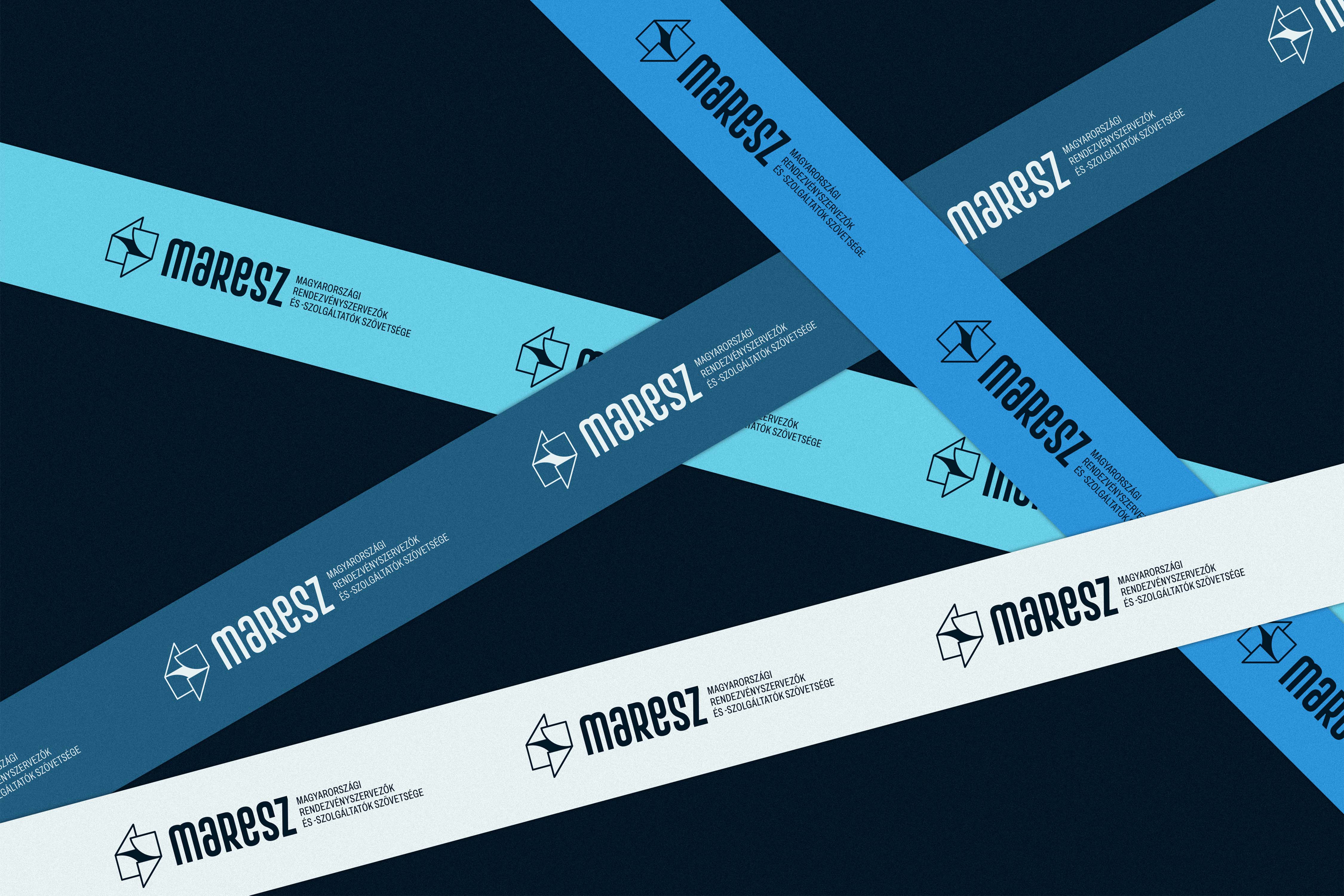
# social media brand identity
# motivational social media branding
# TikTok and Instagram logo design
# content creator brand identity
# mental health and wellness branding
# minimalist black and white visual identity
Designing the brand identity for Selfocus—a motivational social media platform creating short-form content for TikTok and Instagram—required translating the concept of emotional support into a calm, uplifting visual system. Aimed primarily at a youthful audience navigating personal struggles and everyday obstacles, the brand is anchored in a powerful core belief: "What's important is not what you've been through, but what you've become because of it." The primary objective of this project was to create a digital presence that cuts through the noise of fast-moving social feeds. By offering a visual world that feels reassuring, balanced, and united, the identity provides gentle guidance and inner stability for individuals genuinely seeking positive change and self-acceptance. The brand name itself—a seamless merging of "self" and "focus"—directly shaped the conceptual direction of the logo. Designed to feel centered, grounded, and highly intentional, the mark reflects the introspective journey of turning one's attention inward to find emotional clarity. Rather than competing with the platform's video content, the logo acts as a quiet, reliable anchor. Its clean, minimal structure ensures instant recognizability and consistency across various mobile screen sizes and dynamic digital formats, signaling a dependable and supportive presence every time it appears on a screen. To ensure the motivational messages remain the absolute focal point, the aesthetic framework is intentionally restrained. A timeless, neutral color palette built entirely around black, white, and gray strips away unnecessary visual distractions. This high-contrast yet calming combination creates a balanced, inclusive visual "space" that adapts effortlessly to diverse media. This minimalist approach is perfectly mirrored in the typography. Utilizing a modern, calm, and highly readable typeface with a clear hierarchy, the typographic voice is functional and unobtrusive. It allows quotes and short messages to be quickly absorbed on mobile devices without adding emotional or visual noise. Ultimately, this identity positions Selfocus as a grounded, supportive, and emotionally intelligent digital brand. By pairing a centered logo presence with a starkly minimal palette and clean typography, the visual system provides a steady, comforting backdrop for messages of growth and resilience. It communicates genuine empathy and warmth without feeling overly authoritative or sentimental, providing a trustworthy, modern foundation that empowers young individuals to step confidently toward personal stability and inner strength.
Designing the brand identity for Selfocus—a motivational social media platform creating short-form content for TikTok and Instagram—required translating the concept of emotional support into a calm, uplifting visual system. Aimed primarily at a youthful audience navigating personal struggles and everyday obstacles, the brand is anchored in a powerful core belief: "What's important is not what you've been through, but what you've become because of it." The primary objective of this project was to create a digital presence that cuts through the noise of fast-moving social feeds. By offering a visual world that feels reassuring, balanced, and united, the identity provides gentle guidance and inner stability for individuals genuinely seeking positive change and self-acceptance. The brand name itself—a seamless merging of "self" and "focus"—directly shaped the conceptual direction of the logo. Designed to feel centered, grounded, and highly intentional, the mark reflects the introspective journey of turning one's attention inward to find emotional clarity. Rather than competing with the platform's video content, the logo acts as a quiet, reliable anchor. Its clean, minimal structure ensures instant recognizability and consistency across various mobile screen sizes and dynamic digital formats, signaling a dependable and supportive presence every time it appears on a screen. To ensure the motivational messages remain the absolute focal point, the aesthetic framework is intentionally restrained. A timeless, neutral color palette built entirely around black, white, and gray strips away unnecessary visual distractions. This high-contrast yet calming combination creates a balanced, inclusive visual "space" that adapts effortlessly to diverse media. This minimalist approach is perfectly mirrored in the typography. Utilizing a modern, calm, and highly readable typeface with a clear hierarchy, the typographic voice is functional and unobtrusive. It allows quotes and short messages to be quickly absorbed on mobile devices without adding emotional or visual noise. Ultimately, this identity positions Selfocus as a grounded, supportive, and emotionally intelligent digital brand. By pairing a centered logo presence with a starkly minimal palette and clean typography, the visual system provides a steady, comforting backdrop for messages of growth and resilience. It communicates genuine empathy and warmth without feeling overly authoritative or sentimental, providing a trustworthy, modern foundation that empowers young individuals to step confidently toward personal stability and inner strength.


Other Projects
A selection of brand identity and logo design work across diverse sectors, styles, and audiences.