Festival Brand Identity & Logo Design
Festival Brand Identity & Logo Design
Festival Brand Identity & Logo Design
Festival Brand Identity & Logo Design
Hungarian Wool Festival
Hungarian Wool Festival
Hungarian Wool Festival
Hungarian Wool Festival
Case study of a festival brand identity and logo design for the Hungarian Wool Festival, blending cultural heritage, sustainability, and pastoral traditions into a modern visual system.
Case study of a festival brand identity and logo design for the Hungarian Wool Festival, blending cultural heritage, sustainability, and pastoral traditions into a modern visual system.
Case study of a festival brand identity and logo design for the Hungarian Wool Festival, blending cultural heritage, sustainability, and pastoral traditions into a modern visual system.
Case study of a festival brand identity and logo design for the Hungarian Wool Festival, blending cultural heritage, sustainability, and pastoral traditions into a modern visual system.
Client
Hungarian Wool Festival
Client
Hungarian Wool Festival
Client
Hungarian Wool Festival
Client
Hungarian Wool Festival
Year
2026
Year
2026
Year
2026
Year
2026
Industry
Cultural Festival
Event & Festival
Industry
Cultural Festival
Event & Festival
Industry
Cultural Festival
Event & Festival
Industry
Cultural Festival
Event & Festival
Content
Logo Design
Brand Identity
Event Branding
Arts & Culture
Content
Logo Design
Brand Identity
Event Branding
Arts & Culture
Content
Logo Design
Brand Identity
Event Branding
Arts & Culture
Content
Logo Design
Brand Identity
Event Branding
Arts & Culture
Awards & Recognition
Shortlisted:
9th ArtHungry Award (Graphics & Design) - 2026, Hungary
Awards & Recognition
Shortlisted:
9th ArtHungry Award (Graphics & Design) - 2026, Hungary
Awards & Recognition
Shortlisted:
9th ArtHungry Award (Graphics & Design) - 2026, Hungary
Awards & Recognition
Shortlisted:
9th ArtHungry Award (Graphics & Design) - 2026, Hungary

Project Overview
# festival brand identity
# cultural event logo design
# sustainable festival branding
# arts and crafts brand identity
# heritage event visual identity
# tourism and cultural branding
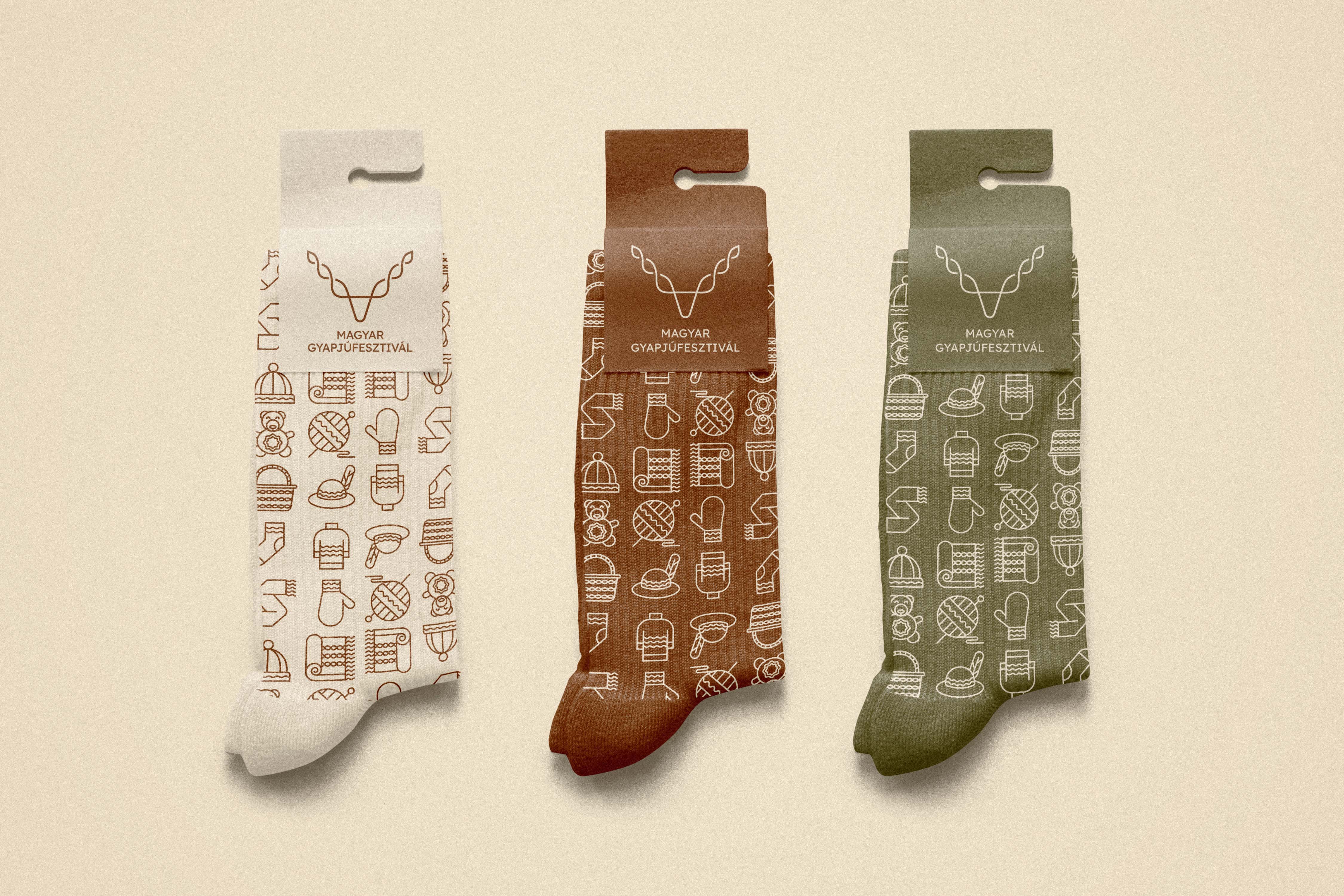
The Hungarian Wool Festival required a brand identity that could do more than just represent a cultural event; it needed to bridge deep-rooted pastoral traditions with a modern, forward-thinking sustainability mindset. Built around the core philosophy—"We weave a future from tradition!"—the visual system positions wool not as a relic of the past, but as a timeless, responsible, and renewable material. The branding is meticulously designed to resonate with a highly diverse audience, from culturally curious tourists and eco-conscious consumers to professional shepherds and craftspeople, maintaining a tone that is respectful, inspiring, and culturally aware. At the heart of this comprehensive identity is a central logo that merges two iconic inspirations into a single, continuous mark. It combines the silhouette of the native Racka sheep and its distinctive twisted, V-shaped horns with the interwoven rhythms of spun yarn. This cyclical, infinite line symbolizes the life journey of wool from the sheep to the finished product, representing both renewal and continuity. Expanding outward from the logo, the brand's broader form language relies on organic, clean, and flowing shapes—circles, spirals, and waves—complemented by tactile textures like raw wool, felt, and canvas to create a warm, modern craft aesthetic entirely free of rigid cliches. To further ground the identity in its natural environment, the color palette draws directly from the Hungarian landscape and pastoral life. A warm, raw-wool beige provides a refined and authentic base, anchored by an earthy terracotta brown reflecting craftsmanship, and a muted Hortobágy olive green symbolizing the grasslands and renewable resources. This delicate balance of heritage and modernity is perfectly echoed in the typography. The historical, crafted elegance of Bespoke Serif is paired with the clean, highly functional, and contemporary sans-serif forms of Satoshi, creating a harmonious dialogue between the past and the present. Ultimately, this branding successfully transforms the festival's mission into a tangible, emotionally resonant visual experience. By weaving together native motifs, organic forms, and a nature-inspired aesthetic, the result is a highly adaptable and professional design system that honors Hungary's pastoral roots while confidently introducing wool to the modern world.
The Hungarian Wool Festival required a brand identity that could do more than just represent a cultural event; it needed to bridge deep-rooted pastoral traditions with a modern, forward-thinking sustainability mindset. Built around the core philosophy—"We weave a future from tradition!"—the visual system positions wool not as a relic of the past, but as a timeless, responsible, and renewable material. The branding is meticulously designed to resonate with a highly diverse audience, from culturally curious tourists and eco-conscious consumers to professional shepherds and craftspeople, maintaining a tone that is respectful, inspiring, and culturally aware. At the heart of this comprehensive identity is a central logo that merges two iconic inspirations into a single, continuous mark. It combines the silhouette of the native Racka sheep and its distinctive twisted, V-shaped horns with the interwoven rhythms of spun yarn. This cyclical, infinite line symbolizes the life journey of wool from the sheep to the finished product, representing both renewal and continuity. Expanding outward from the logo, the brand's broader form language relies on organic, clean, and flowing shapes—circles, spirals, and waves—complemented by tactile textures like raw wool, felt, and canvas to create a warm, modern craft aesthetic entirely free of rigid cliches. To further ground the identity in its natural environment, the color palette draws directly from the Hungarian landscape and pastoral life. A warm, raw-wool beige provides a refined and authentic base, anchored by an earthy terracotta brown reflecting craftsmanship, and a muted Hortobágy olive green symbolizing the grasslands and renewable resources. This delicate balance of heritage and modernity is perfectly echoed in the typography. The historical, crafted elegance of Bespoke Serif is paired with the clean, highly functional, and contemporary sans-serif forms of Satoshi, creating a harmonious dialogue between the past and the present. Ultimately, this branding successfully transforms the festival's mission into a tangible, emotionally resonant visual experience. By weaving together native motifs, organic forms, and a nature-inspired aesthetic, the result is a highly adaptable and professional design system that honors Hungary's pastoral roots while confidently introducing wool to the modern world.


Other Projects
A selection of brand identity and logo design work across diverse sectors, styles, and audiences.