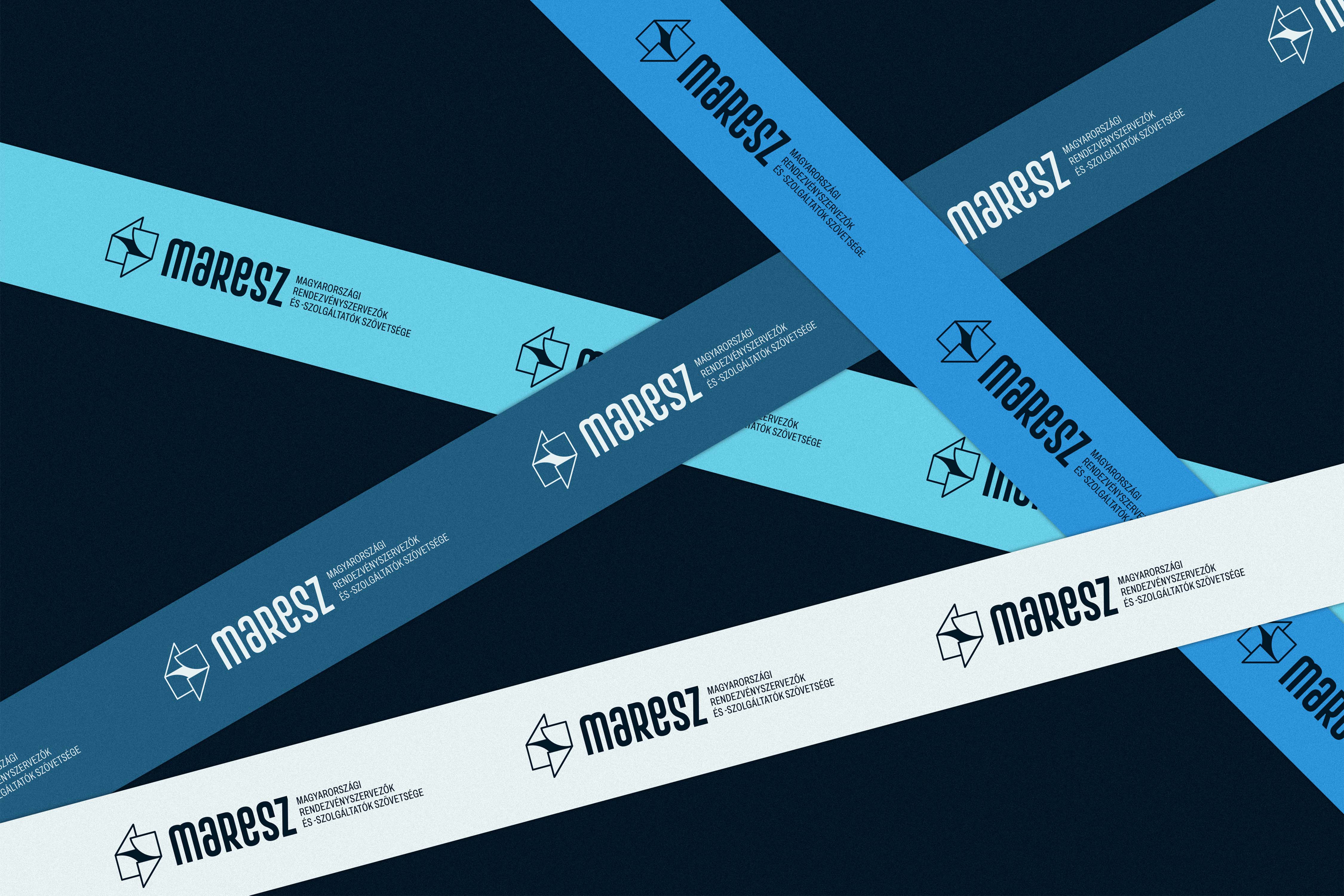
Property Development Brand Identity & Logo Design
Property Development Brand Identity & Logo Design
Property Development Brand Identity & Logo Design
Property Development Brand Identity & Logo Design
Core2
Core2
Core2
Core2
Case study of a property development brand identity and logo design for Core2, a construction project management company, built around architectural precision and structural clarity.
Case study of a property development brand identity and logo design for Core2, a construction project management company, built around architectural precision and structural clarity.
Case study of a property development brand identity and logo design for Core2, a construction project management company, built around architectural precision and structural clarity.
Case study of a property development brand identity and logo design for Core2, a construction project management company, built around architectural precision and structural clarity.
Client
Core2
Client
Core2
Client
Core2
Client
Core2
Year
2023
Year
2023
Year
2023
Year
2023
Industry
Property Development
Real Estate
Industry
Property Development
Real Estate
Industry
Property Development
Real Estate
Industry
Property Development
Real Estate
Content
Logo Design
Brand Identity
Corporate Identity
Property Development
Content
Logo Design
Brand Identity
Corporate Identity
Property Development
Content
Logo Design
Brand Identity
Corporate Identity
Property Development
Content
Logo Design
Brand Identity
Corporate Identity
Property Development

Project Overview
# property development brand identity
# construction project management branding
# property development logo design
# real estate development brand identity
# branding for construction and engineering firms
# corporate identity for property developers
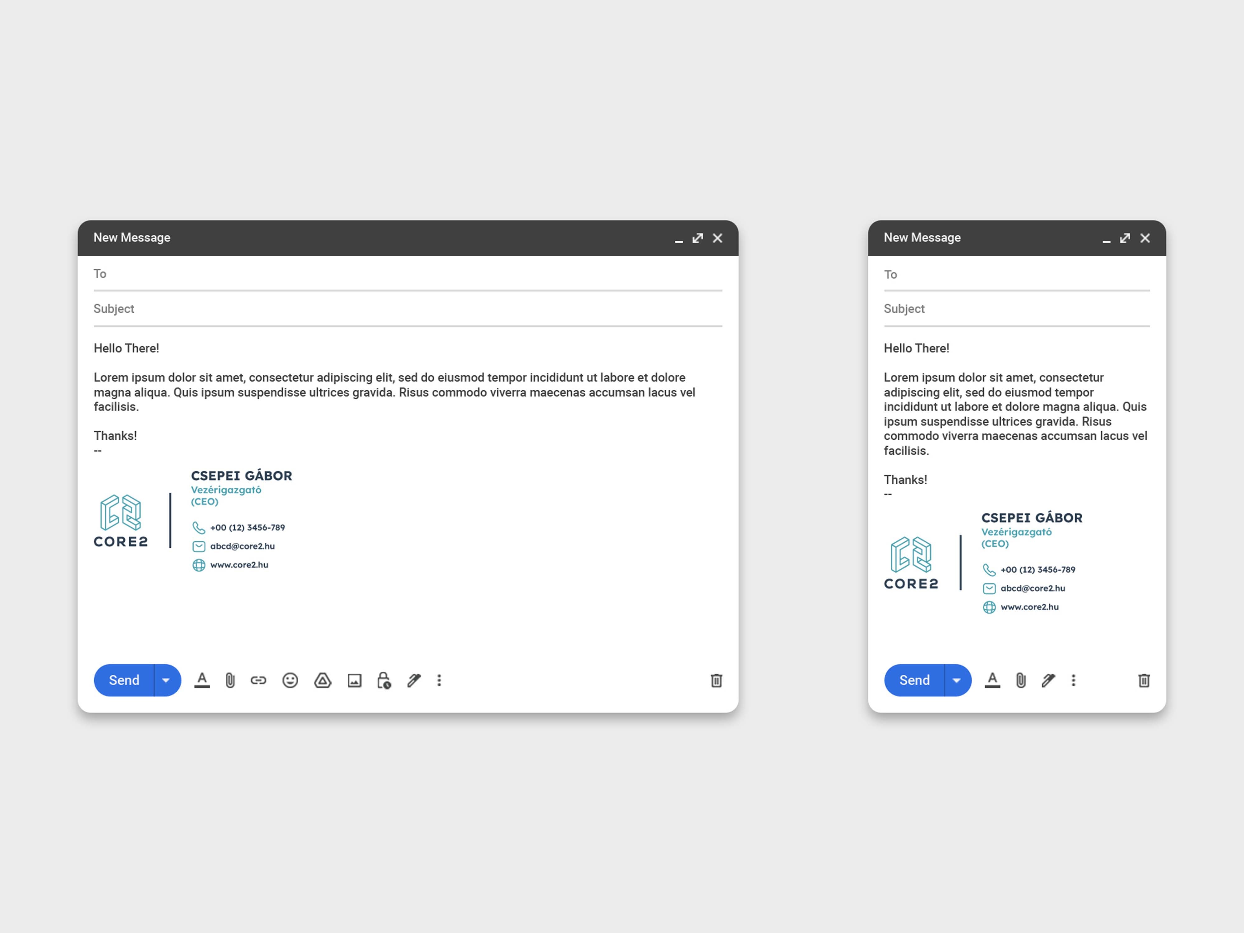
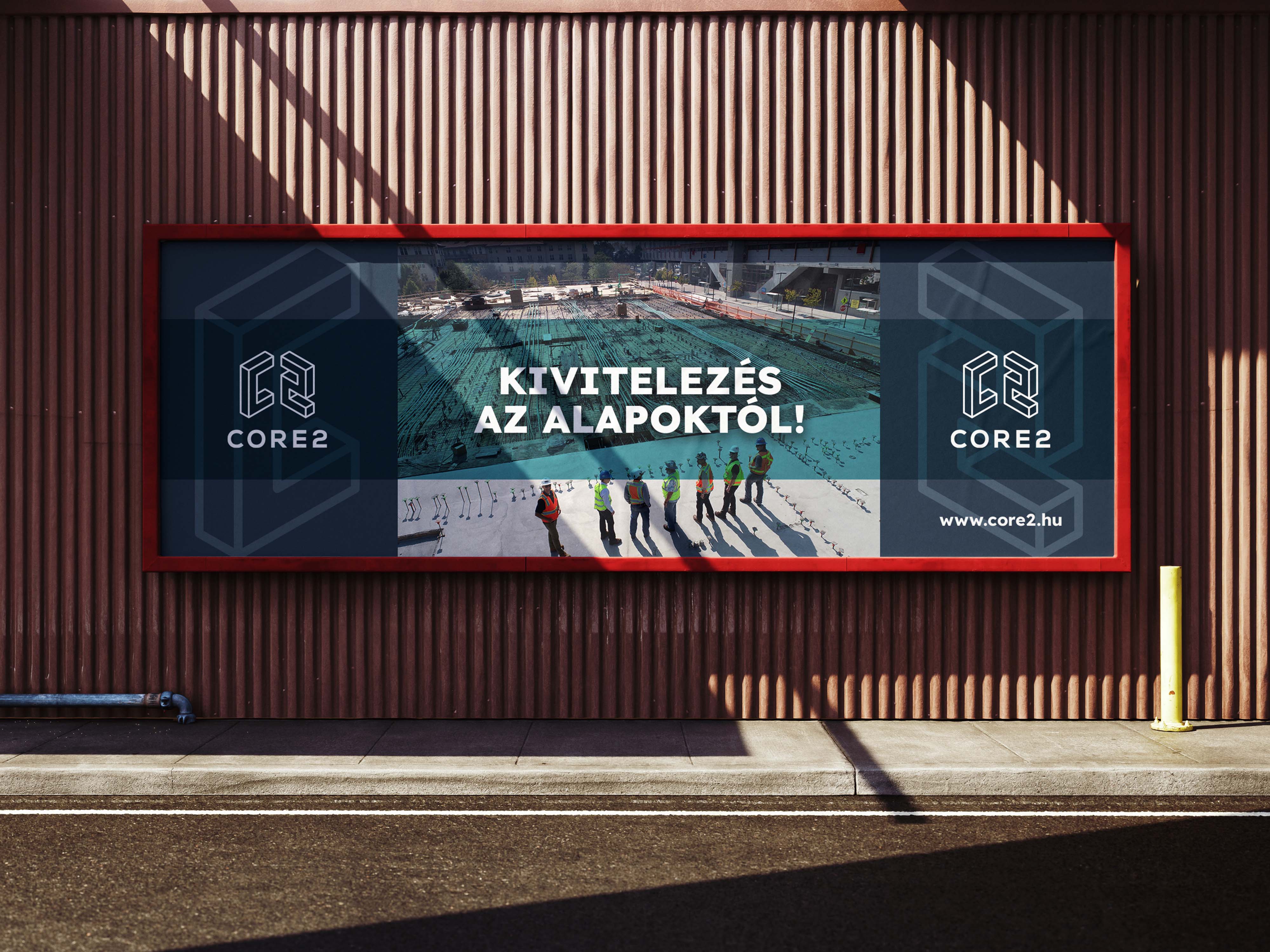
Designing the brand identity for Core2—a Budapest-based company specializing in complex, high-value property development and construction project management—required a visual system that instantly commands respect in an expert-driven market. Overseeing high-stakes real estate lifecycles from early strategic planning to on-site execution, the company needed an identity that radiates unwavering reliability, technical precision, and structural expertise. The central design challenge was to eschew predictable industry clichés—such as generic rooftops or literal building icons—in favor of an intelligent, abstract, and distinctly architectural direction. The resulting identity speaks directly to real estate investors, development partners, and engineering teams, offering a confident, sophisticated, and enduring visual presence. At the conceptual heart of this identity is a striking, isometric logo. Built as a three-dimensional form crafted from the brand's initial and numerical element, the mark is a masterclass in controlled structural abstraction. The geometric perspective deliberately evokes the layered logic of engineering drawings, structural schematics, steel reinforcements, and concrete building grids. Rather than depicting a literal building, this sense of depth communicates the staged workflows and physical reality of development. It provides the brand with a refined, mature symbol that feels entirely aligned with contemporary architectural thinking. The aesthetic choices further reinforce this methodical, high-quality character. The color palette echoes the physical materials of modern construction—steel, concrete, and glass—without feeling cold. A deep steel-blue serves as the foundation, projecting trust, structural integrity, and industrial professionalism. This is contrasted with crisp white for clarity and precision, alongside a cool accent tone that introduces a layer of modernity and freshness to the layouts. This architectural color story is seamlessly paired with the Lexend type family. Chosen for its clean proportions and pristine legibility, this modern typography ensures a calm, professional rhythm across everything from complex engineering proposals and blueprints to digital interfaces and site signage. Ultimately, the Core2 identity captures the very essence of contemporary construction and real estate development. By embracing structural abstraction and a rigorously disciplined visual system, it avoids the pitfalls of extravagant or generic design. The cohesive combination of an isometric logo, an industrial color palette, and highly functional typography positions Core2 as a highly competent, trustworthy expert partner—a brand deeply grounded in precision, integrity, and architectural excellence.
Designing the brand identity for Core2—a Budapest-based company specializing in complex, high-value property development and construction project management—required a visual system that instantly commands respect in an expert-driven market. Overseeing high-stakes real estate lifecycles from early strategic planning to on-site execution, the company needed an identity that radiates unwavering reliability, technical precision, and structural expertise. The central design challenge was to eschew predictable industry clichés—such as generic rooftops or literal building icons—in favor of an intelligent, abstract, and distinctly architectural direction. The resulting identity speaks directly to real estate investors, development partners, and engineering teams, offering a confident, sophisticated, and enduring visual presence. At the conceptual heart of this identity is a striking, isometric logo. Built as a three-dimensional form crafted from the brand's initial and numerical element, the mark is a masterclass in controlled structural abstraction. The geometric perspective deliberately evokes the layered logic of engineering drawings, structural schematics, steel reinforcements, and concrete building grids. Rather than depicting a literal building, this sense of depth communicates the staged workflows and physical reality of development. It provides the brand with a refined, mature symbol that feels entirely aligned with contemporary architectural thinking. The aesthetic choices further reinforce this methodical, high-quality character. The color palette echoes the physical materials of modern construction—steel, concrete, and glass—without feeling cold. A deep steel-blue serves as the foundation, projecting trust, structural integrity, and industrial professionalism. This is contrasted with crisp white for clarity and precision, alongside a cool accent tone that introduces a layer of modernity and freshness to the layouts. This architectural color story is seamlessly paired with the Lexend type family. Chosen for its clean proportions and pristine legibility, this modern typography ensures a calm, professional rhythm across everything from complex engineering proposals and blueprints to digital interfaces and site signage. Ultimately, the Core2 identity captures the very essence of contemporary construction and real estate development. By embracing structural abstraction and a rigorously disciplined visual system, it avoids the pitfalls of extravagant or generic design. The cohesive combination of an isometric logo, an industrial color palette, and highly functional typography positions Core2 as a highly competent, trustworthy expert partner—a brand deeply grounded in precision, integrity, and architectural excellence.


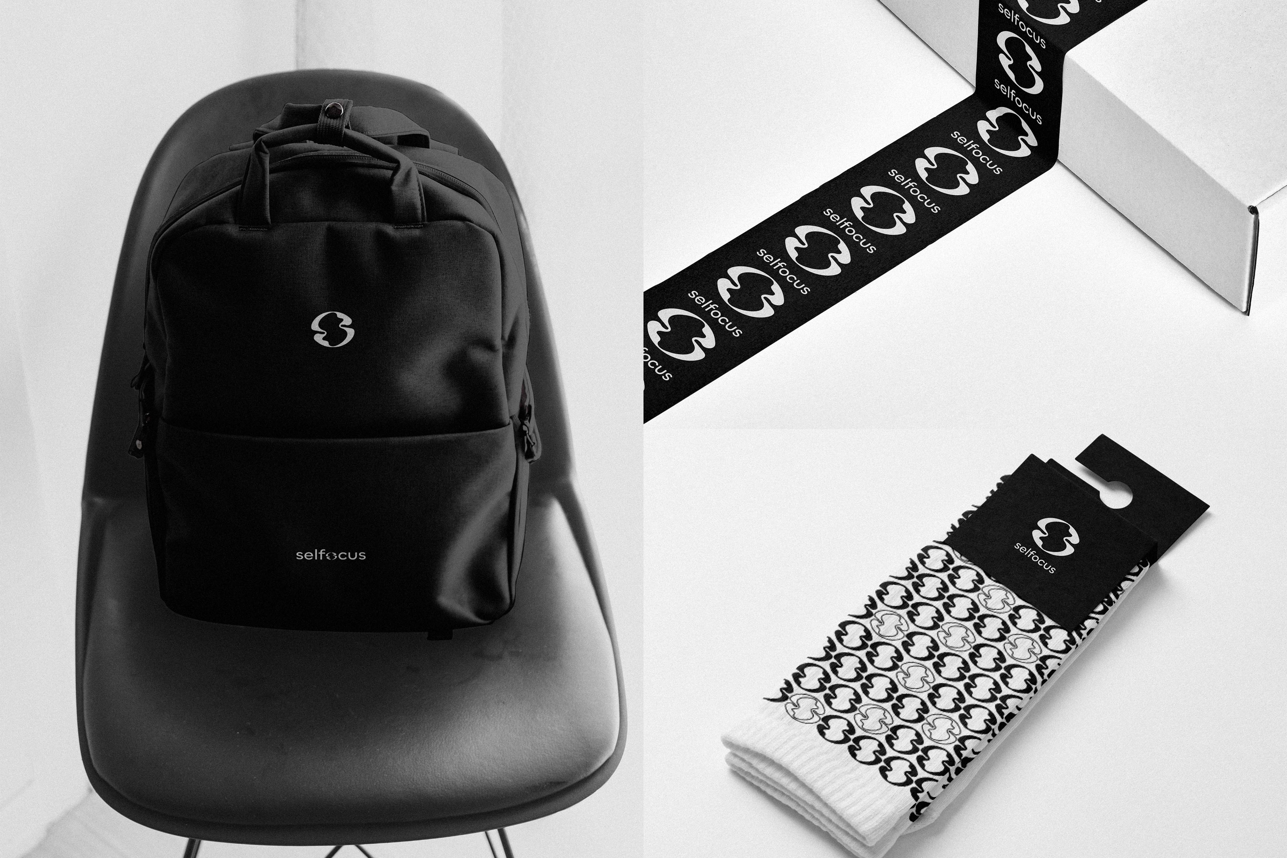
Other Projects
A selection of brand identity and logo design work across diverse sectors, styles, and audiences.